- September defies its weak reputation with the S&P 500 showcasing remarkable strength.
- An upsurge in outperforming stocks underlines robust market breadth, hitting the highest levels since 2002.
- Explore five crucial charts indicating strong momentum for the S&P 500 into the final quarter of 2024.
September is often cast as a troubled month, historically synonymous with underperformance. However, this year has tossed that storyline aside, as the index gears up to deliver one of its most robust September showings in recent memory.
The number of stocks outpacing the S&P 500 has skyrocketed to its loftiest heights since 2002, painting a vivid picture of the market’s exceptional vitality.
With bullish indicators proliferating, let’s delve into five key charts showcasing the defiance of historical norms by the S&P 500 this month and hinting at a potential continuation of its momentum as we journey towards the conclusion of 2024.
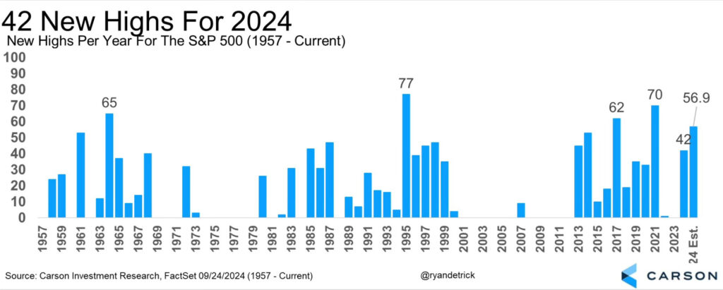
Chart 1: S&P 500 Sets New Highs Unprecedentedly
The S&P 500 recently marked a milestone by reaching three new all-time highs in a single week, pushing its total for 2024 to an impressive 42.

This chart visually encapsulates the regularity of all-time highs for the S&P 500, vividly illustrating its stellar performance amidst the backdrop of September’s conventional narrative.
Chart 2: Resilient Positive Weeks Streak
Amidst the past year, the index has displayed an unwavering resilience, with 35 weeks culminating in positive returns—an impressive 67% of the time. This consistent trend signifies robust market momentum.

Chart 3: Surge in Outperforming Stocks

This depiction showcases the proportion of stocks outshining the S&P 500, signaling the broad strength of the market and reaching its pinnacle since 2002.
Chart 4: Disinflationary Trends in Focus

This chart maps the year-on-year disinflation rate reflected by the . It exhibits a modest decrease from +2.45% to +2.23%, confirming the enduring presence of disinflationary behavior.
Chart 5: Evolving Labor Market Dynamics

This graphical representation of the data traces the labor market’s trajectory since September 2021, portraying a rapid descent followed by an extended period of sideways movement, dismissing concerns over significant deterioration.
In Conclusion
I urge you to examine these graphs and data closely; the current bullish wave carries substantial momentum.
This juncture offers an opportunity for introspection, questioning the voices that have shaped your market perceptions of late.
If you’ve adhered to a bearish stance and remained on the fringes, reflect on whose counsel guides your present views of the market.
Should someone persistently propagate inaccurate, futile bearish tales, ponder why they deserve your continued attention.
***
Disclaimer: This piece provides informational insights solely. It does not advocate asset acquisition and does not serve as a solicitation, offer, recommendation, or investment suggestion. Remember, all assets carry varying risks and entail thorough evaluation before investment. No investment advisory services are provided.
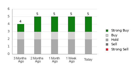
5 Stocks Our Experts Predict Could Double In the Next Year
By submitting your email, you'll also get a free pivot & flow membership. A free daily market overview. You can unsubscribe at any time.